Hello and welcome to part two of this series! I'm Mary, a Science Communication intern at Dr. Jimenez Soto's Living Agroecology Lab.
After refreshing the main navigation, it was time to focus on the pages themselves. With a more succinct header, it was easier for me to find the pages with higher priority. These were News, Research, and People which are now found in a dropdown under About.
News and Research
I worked on these pages around the same time, not quite finishing one before starting the other. This is mostly because I was getting familiar with the CMS and I didn't know it's limitations. I used Squarespace's draft feature to redesign before exchanging the previous version with the new one. Unfortunately, because Squarespace doesn't have a live server option, I had to make final changes when the new version was live.
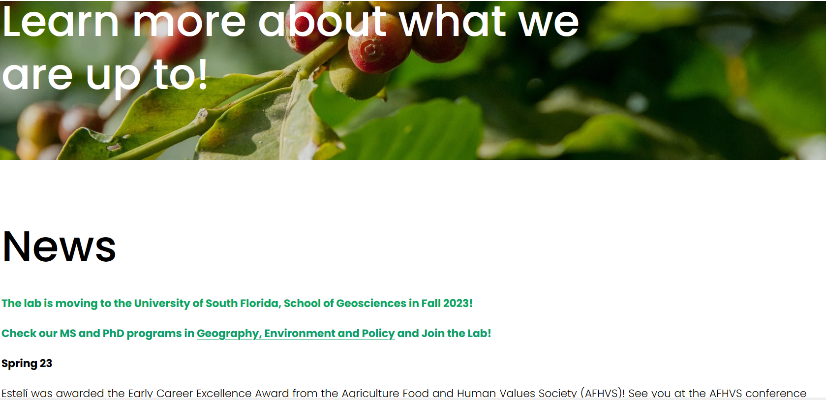
Anyway, onto the specifics. Starting from top to bottom. The News page received the biggest changes. The original version was a plain text page that was last updated on 2023. That was three years ago!
Based on other science websites, my plan was to remake this page into something more dynamic. A news blog of sorts. Because I wasn't sure what kind of templates Squarespace offered, I did all the work on a draft page on Squarespace. No sketches, no wireframing. All bets were off.
Here's the original version:
Figure 12. News section before refresh.
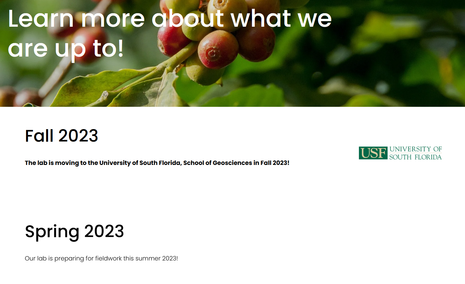
And this is my version:
Figure 13. News sections after refresh.
Clicking on each title leds to another page with the full article. I added images wherever I could to give it some pizzazz.
Note: I guess this is a good place to mention this as any. My design tools were limited to Squarespace's offer in the current plan. Likewise, my design choices had to match the website's color scheme. I also had to limit adding custom CSS because I believe it would be more of a hindrance to the website owner in the near future. While my hands were really tied on this one site, I enjoyed the challenge and I learned a lot about my web design preferences!
Last but not least, after the whole refresh was done, I published a new blog post summarizing all the changes. Nothing like an update to celebrate!
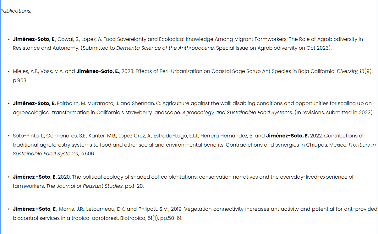
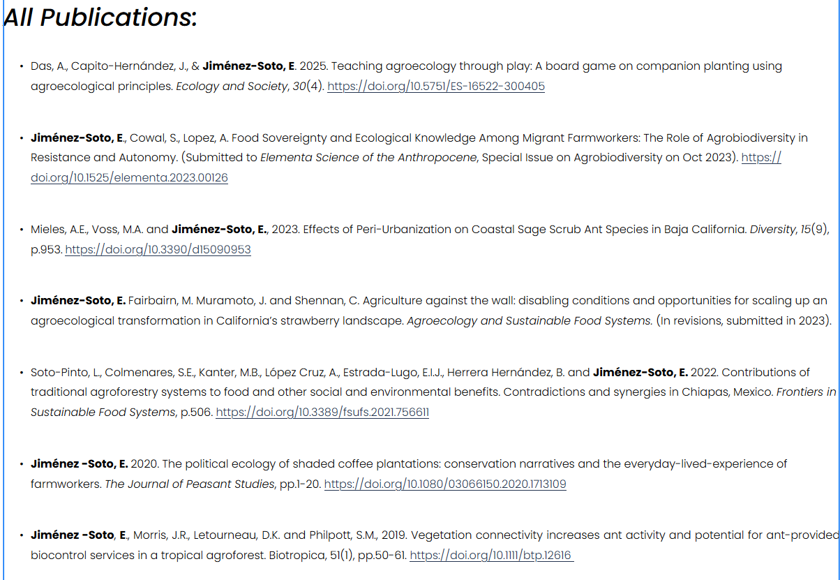
The Research page received the least amount of changes. Like noted in the list on part 1, I considered it was important to add the DOI to each paper citation. Putting myself in the shoes of a visitor, I would like to have the option of easily access the listed papers. Aside from that, I increased the size of the subheading and edited it for clarify. That was pretty much it!
Figure 14. Research section before update.Figure 15. Research section after update.
People
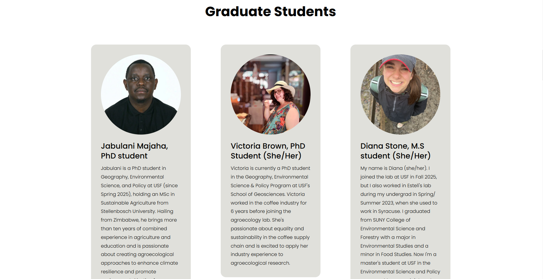
Last but not least, the People section required a solid update. From design to text, I listed current and previous lab members and added new ones (like me!). To this end, I had contacted the rest of the new members requesting a picture and an introduction for the website. Classifying member by their educational status (Graduate, Post Doc, and Undergrad) was a request from the site owner.
I drafted this page in Markdown before moving to Squarespace because of the new information I had to add. When I got most of it, I jumped into the CMS, created a draft page, and started working.
This is probably my favorite page from this whole project. I'm really proud of the final result! Unfortunately I didn't take a screenshot to show the before but I do have one of the final result:
Figure 16. Snippet of the live version of the People section.
I love how the circular shape of the profile picture pairs with the rounded corners of the background. I couldn't contain myself and added some custom CSS to create the rounded corners with the help of Squarespace forums.
    /* this piece of code adds rounded corners to the background colors in each profile at the People section /*


.list-item[data-is-card-enabled="true"] {

    border-radius: 1.1rem;

}
And yes, the refresh was heavily supported by the official Squarespace forums, the official website, and the associated subreddit. I found the answers to every question I had about what I could and couldn't do with this CMS. Hooray for community!
The Final Touches and Notes on Accessibility
Cut down extra space between objects and improved object alignment.
Improves access to RSS feed by adding a button to the footer.
Optimized all pages for mobile.
Next time: The second part of this project. Join me for some pretty tables and to learn how I made a case to change the Squarespace plan to something a tad cheaper without losing all the tools and benefits the site currently relies on.
I can't really take credit for this. Let's say I should have just asked the website owner to write them because the context behind the images was more meaning that an actual description. So while I really wanted to add alt text, I felt like my only option was to "cut corners." After telling the website owner about it, they rewrote the LLM's alt text. Now I know better than to let an LLM replace a human's job. Hooray for humans and context! ↩︎