Hi there! I'm Mary Seph, Science Communication intern at Dr. Jimenez Soto's Living Agroecology Lab. The lab focuses on learning about plant-insect interactions to promote biodiversity conservation and empower small-scale farmers. This intersection between food systems and biodiversity conservation is known as agroecology. Today I want to share how I refreshed the lab’s website, improving accessibility and reducing noise.
First, a bit about my background. I'm an Environmental Science undergrad at the University of South Florida in the United States. I love science, tech, and communicating science to anyone who is willing to listen. In the past few years, I have been dipping my toes in front-end web development, a fancy word for making websites. I consider myself a strong advocate of the Indie Web ethos and I'm passionate about accessibility in the digital world.
With that out of the way, here's how I got to tinker with the first website that I hadn't created myself.
First, the website owner, Dr. Jimenez-Soto, was kind enough to lend me access to the website's host and editing software, Squarespace. Because I have more experience getting my hands dirty using a code editor, it was my first time using a drag-and-drop option like this. I was excited because the experience of using a mainstream web design platforms was bound to be useful in the future.
Before the internship, I visited every page and took notes on broken links, outdated sections, and potential accessibility concerns.
My notes looked like this:
Publication and Research page
No links for published papers, nor DOI.
People page
Any new people apart from me?
Gallery page
Images don't have captions. Viewers have little context of each image.
Accessibility could be improved if images don't have alt text.
Course Materials section
Anything that can be added?
Footer section
About page leads to a broken link
Join The Lab link is broken
Header and Footer
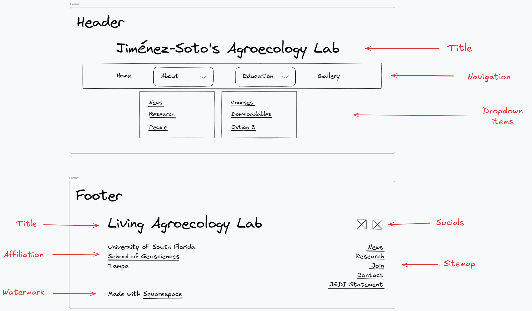
I noticed that the header and footer were rather cluttered including elements with broken links. Thus, I decided that the first order of the day was to update the header and footer!
Armed with pen and paper, I got brainstorming. The header had two buttons at the left and right sides that led to a inactive social media account and a call to action respectively. I chose to remove the former because there was little point to having a link to an inactive account. The call to action was crucial, so I wanted to weave it into the website’s experience. For the nav links themselves, I condensed the eight tabs into four by implementing dropdowns. My goal was to provide potential visitors with an easy to navigate experience. Thus, I condensed the "News", "People", and "Research" nav links into a dropdown called "About". In addition, I condensed the lab's college course offerings and free educational materials under a dropdown called "Courses."
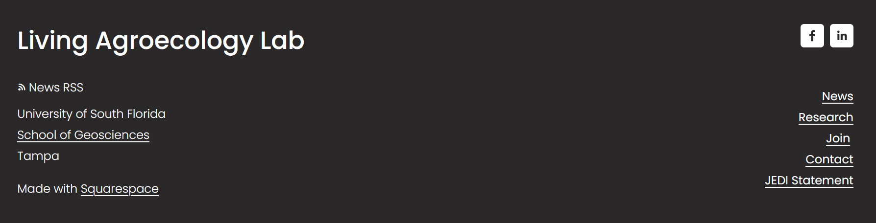
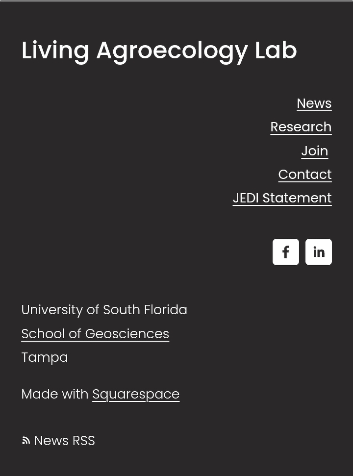
For the footer, I aimed to offer specific pages that were of interest to site visitors and promoted an accurate image of lab's research mission. For the design, I referred to government websites like NOAAA and the MIT's Media Lab. From that experience, I figured the "News" and "Research" pages would be the pages visitors would be most interested in. Lastly, I added the links to the call action and the JEDI (Justice, Equity, Diversity, and Inclusion) Statement from the header.
This is the final design of the header and footer. Made with Excalidraw:
Figure 1. Final sketch of header design.
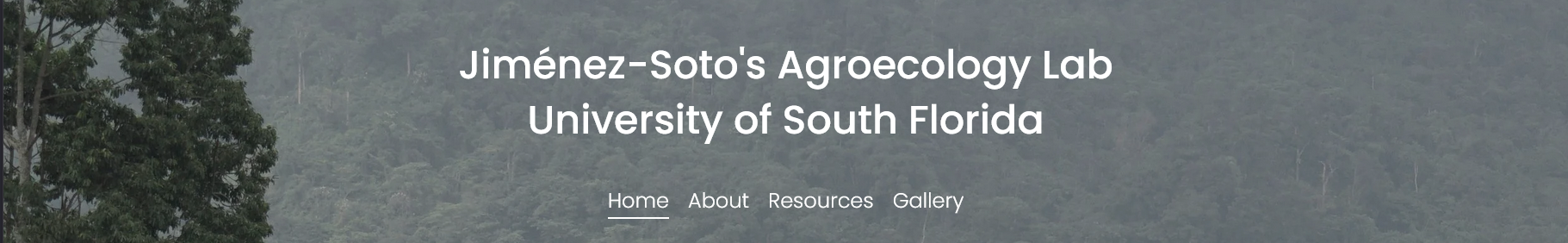
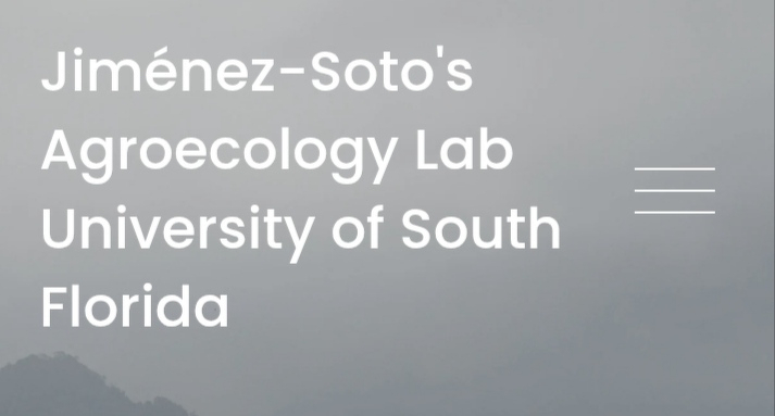
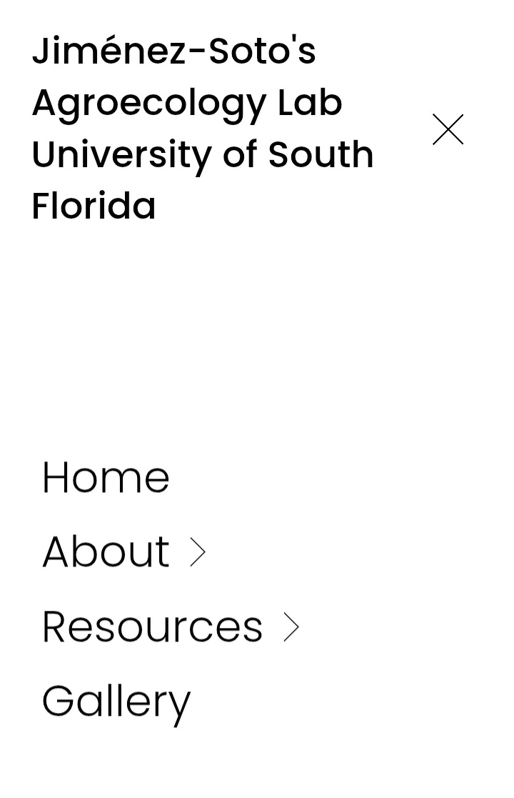
After getting the okay from the website owner, I started implementing the design for both desktop and mobile.
Figure 2. Live version of website's header. Desktop version.
Figure 3. Live version of website's header. Mobile version. Closed.
Figure 4. Live version of website's header. Mobile version. Open.
Figure 5. Live version of website's footer. Desktop version.
Figure 6. Live version of website's footer. Mobile version.
Finally, I tested Squarespace’s dropdown feature for accessibility, making sure all links were possible to access with a keyboard.
News and Research
After refreshing the main navigation, it was time to focus on individual pages. With a succinct header, it was easier to choose what to work on next. I decided to focus on the About page, News, Research, and People. From browsing other science lab’s websites, the About pages where the first I visited, so I decided to prioritize them.
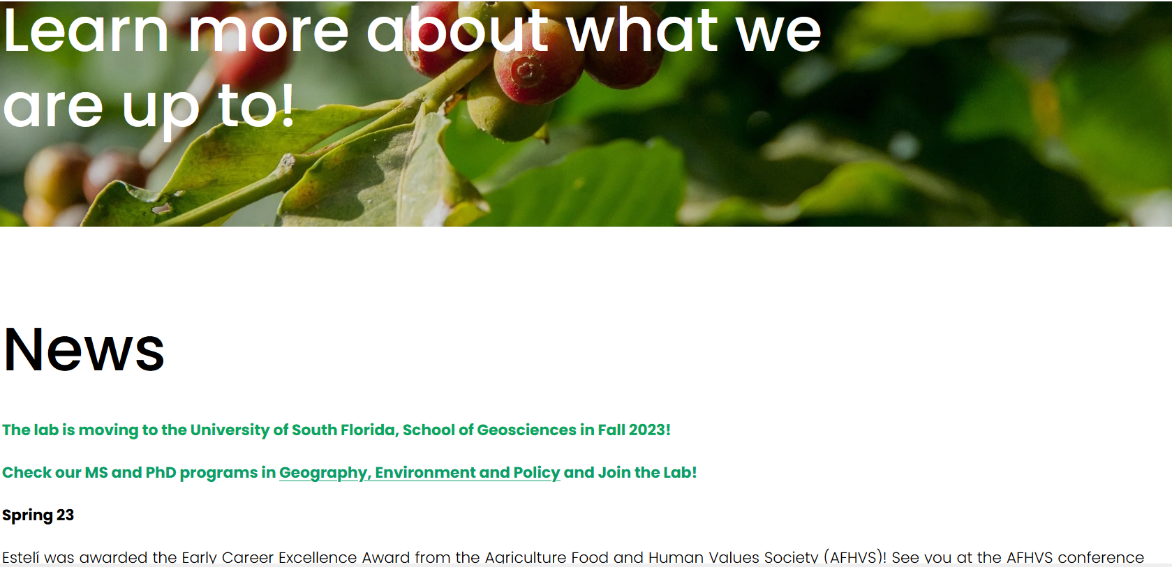
Starting from top to bottom, the News page received the biggest changes. The plan was to remake it into a blog of sorts. Because I wasn't sure what kind of templates Squarespace offered, I worked directly on Squarespace’s drafts.
Here's the original version:
Figure 12. News section before refresh.
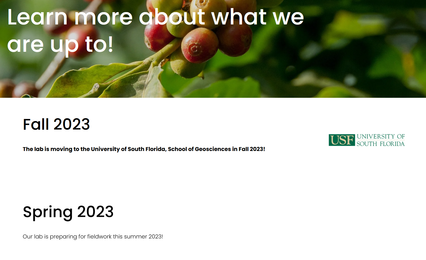
And this is my version:
Figure 13. News sections after refresh.
Clicking on each subtitle leads to another page with the full version. I added images wherever I could to give the page some pizzazz.
Note: My design tools and choices were limited to Squarespace's plan offering and the website's established color scheme. In addition, I had to refrain from writing custom CSS because it would be more of a hindrance to the website owner. Despite the limitations, I enjoyed the challenge and learned a lot about my web design preferences.
Finally, after the whole refresh was done, I published a new blog post summarizing all the changes. Nothing like a final report to wrap up a project.
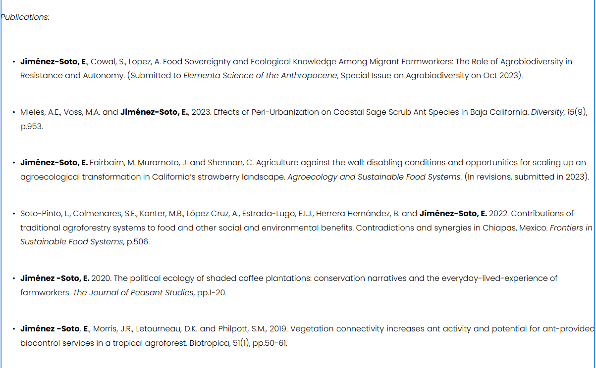
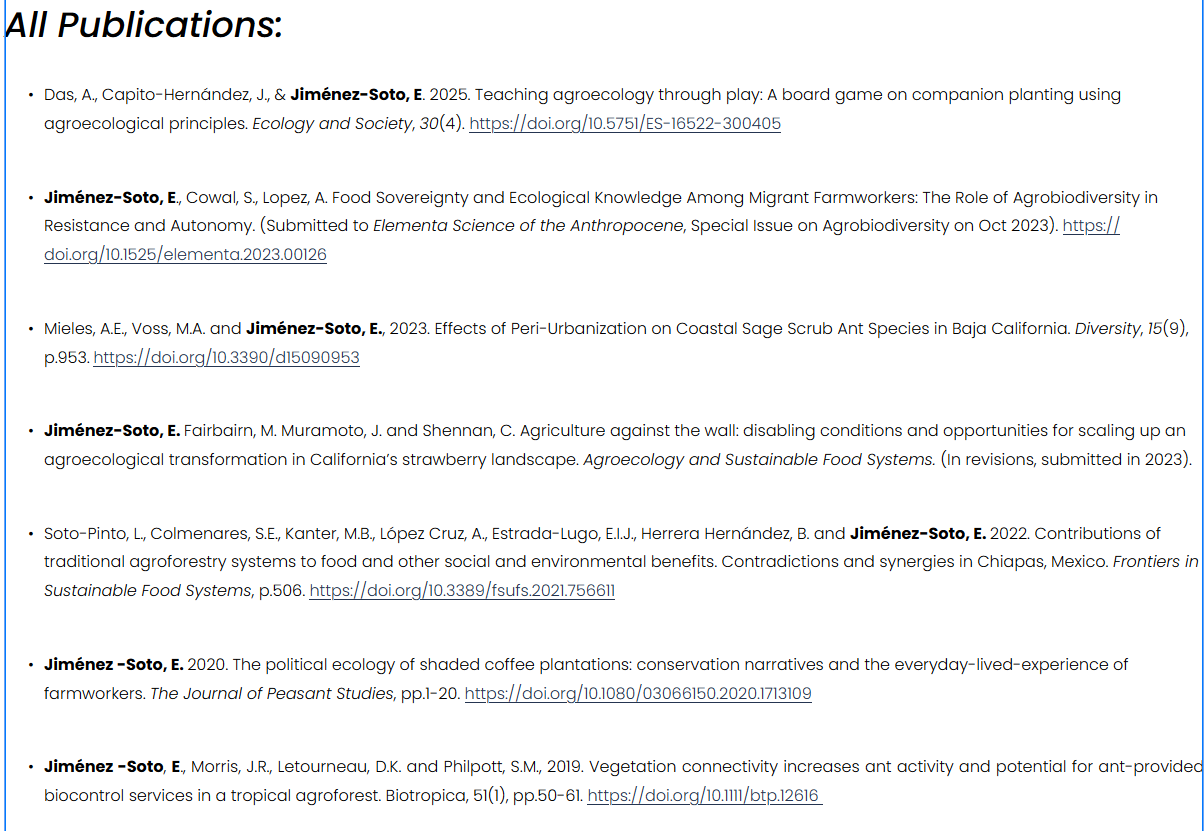
The Research page received the least number of changes. As noted above, adding the DOI to each citation was a crucial change because I wanted the published papers to be easily accessible. Aside from that, I enlarged the subheading and edited it. I also added the latest published paper. That was all!
The results:
Figure 14. Research section before update.Figure 15. Research section after update.
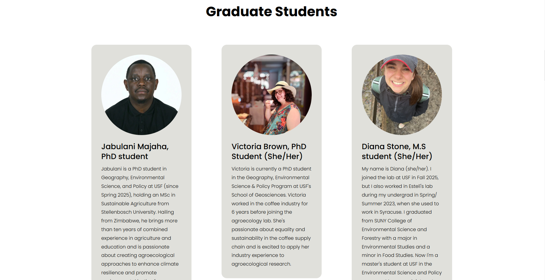
People
Lastly, the People section required an extensive update. From design to text, I listed current and previous lab members and added new ones (like me!). To this end, I contacted the new lab members requesting a picture and an introduction.
I began drafting this page using Markdown before moving to Squarespace because of the new information I had to add. I changed the page’s layout with the new format the website owner requested, listing members by their educational status (Graduate, Post Doc, and Undergrad).
This is probably my favorite page from this whole project. I'm proud of the result! Unfortunately, I didn't take a screenshot before the changes but here is a snapshot of how it looks now:
Figure 16. Snippet of the live version of the People section.
I love how the circular shape of the profile picture pairs with the rounded corners of the background. I couldn't contain myself and added some custom CSS to design the latter with the help of Squarespace forums. The piece of code I used was,
    /* this piece of code adds rounded corners to the background colors in each profile at the People section /*


.list-item[data-is-card-enabled="true"] {

    border-radius: 1.1rem;

}
This refresh was heavily supported by the official Squarespace forums, the official website, and the associated subreddit. I found the answers to every question about what I could and couldn't do with this CMS. Hooray for
community!
The Final Touches and Notes on Accessibility
Cut down extra space between objects and improved object alignment.
Improves access to RSS feed by adding a button to the footer.
Optimized all pages for mobile.
Can't take credit for this. The context behind the images was more meaningful than an actual description (eg. time and place) and I couldn’t provide it. ↩︎