How to Refresh a Science Website (Part 1)
Hi there! I'm Mary Seph, Science Communication intern at Dr. Jimenez Soto's Living Agroecology Lab. Today I want to share how to refreshed her website, covering some accessibility issues and improving its aesthetic appeal.
But first, my background. I'm an Environmental Science major at the University of South Florida in the United States. I love science, tech, and communicating science to anyone who is willing to listen. Over the past few years, I have been dipping my toes in front-end web development which is a fancy word for making websites. I consider myself a strong advocate of the Indie Web and I'm passionate about accessibility in the digital world.
With that outta the way, here's how I got to tinker with the first website that I hadn't created myself!
First, the website owner, Dr. Jimenez Soto was kind enough to lend me access to the website's backend software, Squarespace. Because I have more experience getting my hands dirty using a code editor, it was my first time using a drag-and-drop option like this. I was really excited because as a popular website making option, the experience was bound to be useful in the future.
Now, to start this refresh, I didn't go blind. Before the start of the internship, I took a look at the website and noticed a lot of areas of improvement. I visited every page and took notes on broken links, outdates section, and accessibility concerns.
The last version of my notes look kind of like this:
-
Publication and Research page
- No links for published papers, nor DOI.
-
People page
- Any new people apart from me?
-
Gallery page
-
Images don't have captions. Viewers have little context of each image.
-
Accessibility could be improved if images don't have alt text.
-
-
Course Materials section
- Anything that can be added?
-
Footer section
-
About page leads to a broken link
-
Join The Lablink is broken
-
Header and Footer
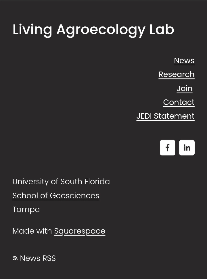
When it got to get started on this project, I went with my gut. I noticed that the header and footer had many elements, some whose links where broken or obfuscated the lab's main focus. Thus, I decided that the first order of the day was to update the header and footer!
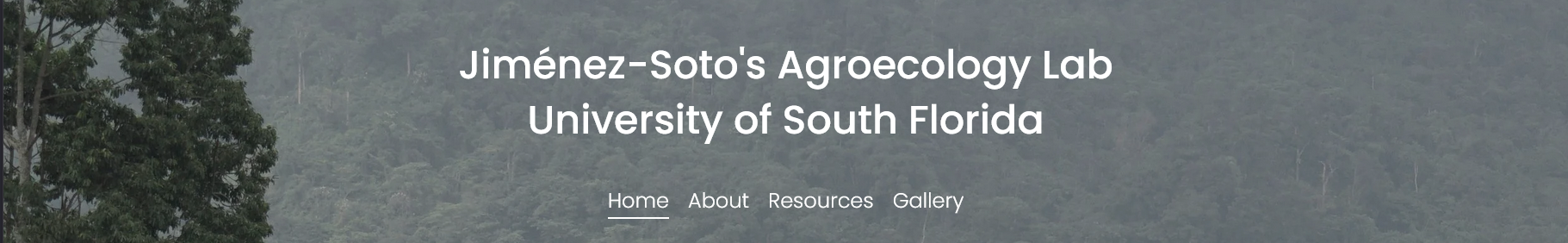
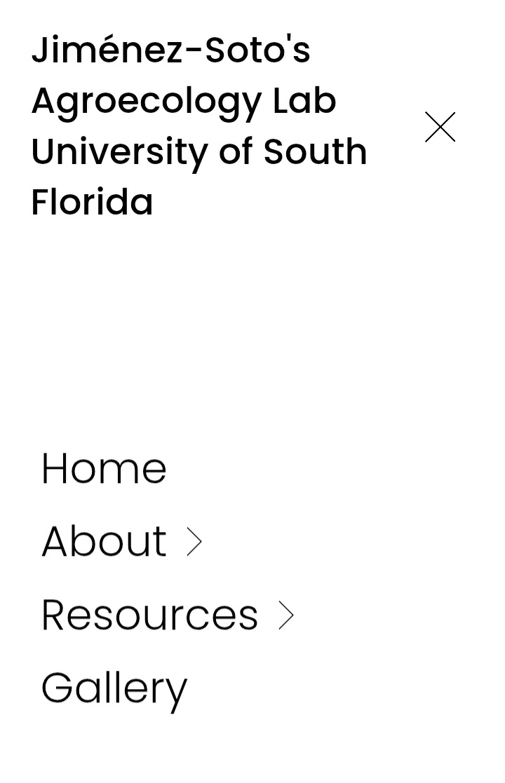
Armed with pen and paper, I got brainstorming. The header had two buttons at the left and right sides that led to a inactive social media account and a call to action respectively. I decided to remove the former because I considered there was little point to having a link to an inactive account. For the call to action, as science lab, this is important so I wanted to find a way to weave it into the experience. As for the nav links, I condensed the eight tabs into four by implementing dropdowns. My goal was to provide potential visitors with an easy to navigate experience. I condensed the "News", "People", and "Research" nav links into a dropdown called "About". Likewise, I condensed the lab's college course offerings and free educational materials under a dropdown called "Courses."
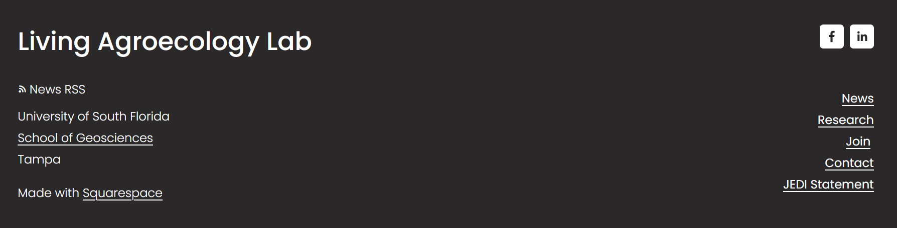
For the footer, I found it just as overloaded with information as the header. Thus, my cleanup focused on offering specific pages that were of interest to site visitors and promoted an accurate image of lab's missions. I took great inspiration from government website's like NOAAA and the MIT's Media Lab. I figured "News" and "Research" would be the pages people would be most interested in because that's those were the lab's strongest offerings. I added links to the call action here and the JEDI Statement which was also in the nav.
Note: While many times I've had the urge to change the content of certain pages, I considered it wasn't the most efficient use of my skills. Moving pieces and building were two different skillsets. There's so much that could be improved for this site and I was just a single intern!
This is the final design of the header and footer. Made with Excalidraw:
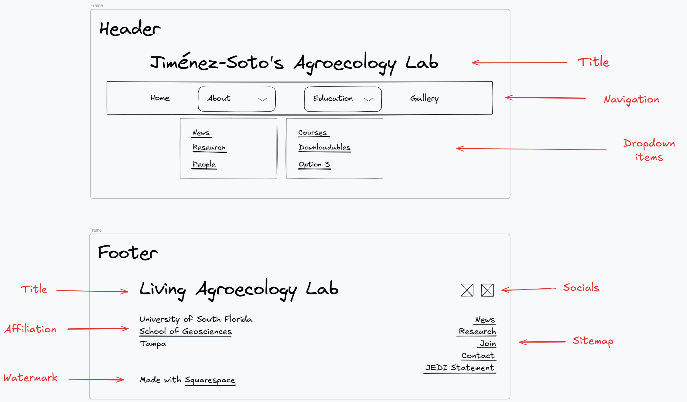
I have read that dropdowns can be inaccessible if they aren't keyboard focusable but Squarespace was good with that. After I sending this to Dr. Jimenez-Soto and getting the okay, I started implementing the design for both desktop and mobile versions.

Next part: Refreshing the pages themselves!